Organizations that want to hire the best and keep the best, have to take their training and development programs seriously. Employees expect it from their employers. Simply providing information and running basic training programs does not cut it any longer.
Your program must match the modern era.
If you don’t prioritize program design and the learner experience, your employees will have a hard time trusting that the information you share is relevant and valuable. Make your learning experience irresistible with a program that celebrates quality information and great design.
The New Normal for Training Programs
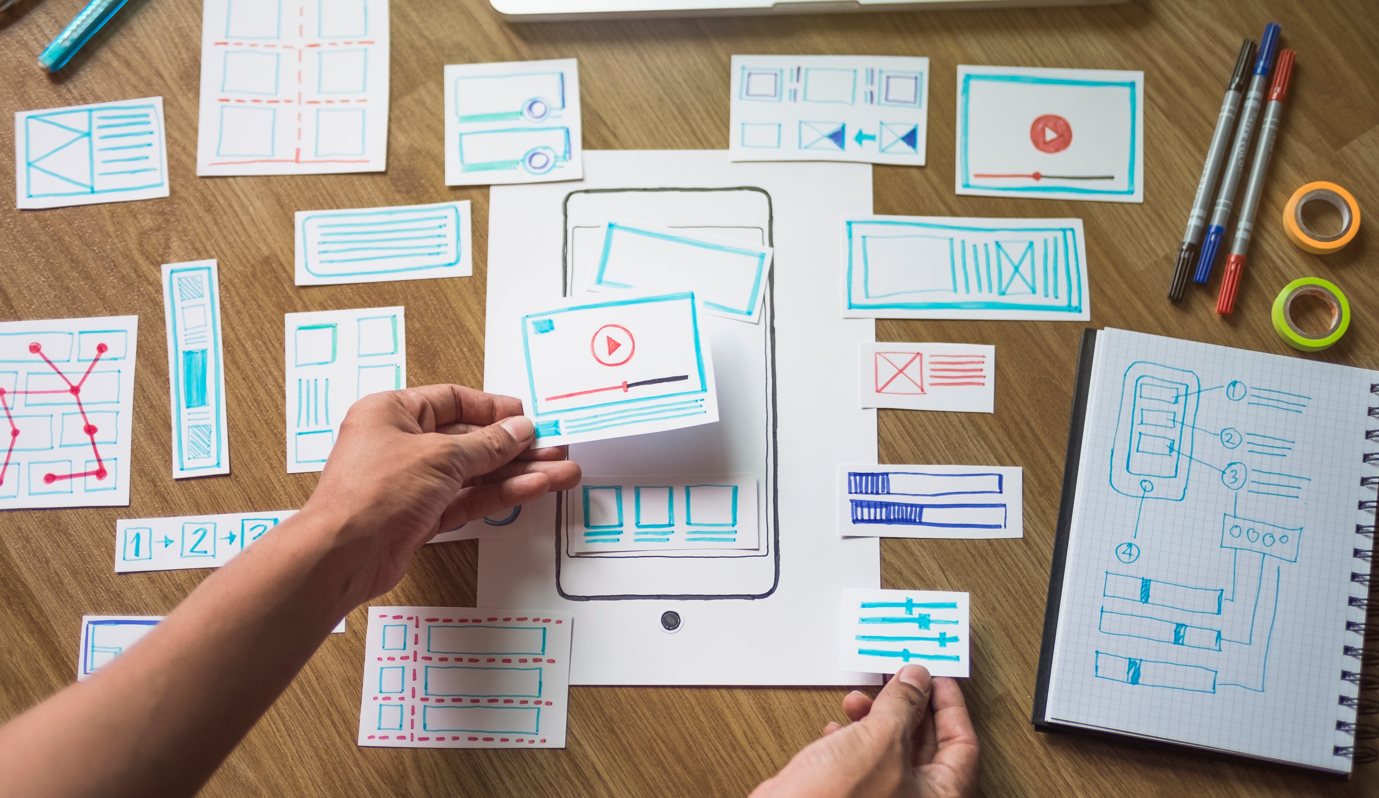
If we’ve said it once, we’ve said it a million times. User Interface is more than just packaging. People using your enterprise-grade training program are used to interacting with consumer-grade apps and tools. If your training materials are not designed and delivered well, the learner will automatically dismiss the information they take in as outdated, obsolete and unmemorable.
The aesthetic of your training platform and materials is the first signal to the learner indicating how much care you’ve put into the program. In return, they will know how much care they should take in completing it. Make it beautiful, make it count.
One Size Doesn’t Fit All
Your people are constantly bombarded with new information and there isn’t enough time in the day to take it all in. Ditch the one-size-fits-all approach to learning, and target your employees with meaningful information that is specific to them.
Have a sales team you want to update with training? Need managers to know about a new policy? Make that information available to only those who need to see it. Employees will look forward to new training opportunities when it’s a truly customized learning experience. Bonus points if your training app is customizable too. Check out Bigtincan Zunos's Customizable Dashboards where you build the learning experience.
Make It Accessible Anywhere
The modern workforce is remote, mobile and on the go. Your learning materials should be accessible on smartphones, tablets and on desktop. Let your learners interact with content on their smartphone during their morning commute, or pull up information on their tablet when they need to recall it during a meeting.
Intuitive Platforms Make A Difference
Your employees are used to smooth running apps that are sleek and easy-to-use. Deliver the same experience with your training and development by making content easy to access no matter the device they use.
Make sure new training content is easy to find and keep information organized. Employees shouldn’t have to hunt through content to find the information they need. With just a few taps they should be able to search and locate new information or pull up old learning materials to refresh their memory when needed.
Companies and organizations who aim to attract and retain the best talent on the market no longer have the option to offer sub-par corporate education and training programs. People will go where the opportunities are. They will go where growth and education is happening. They will go to the companies who prioritize their experience as learners, as professionals and as people.
If you are looking for a training platform that values end user design, look no further than Bigtincan Zunos. Get a demo and see first hand all the work that goes into making the user experience incredible.


